
How to Choose the Right Look
Choose a cinematic Look by reading the scene, lighting, subject, and intended feeling instead of searching for a universal preset.
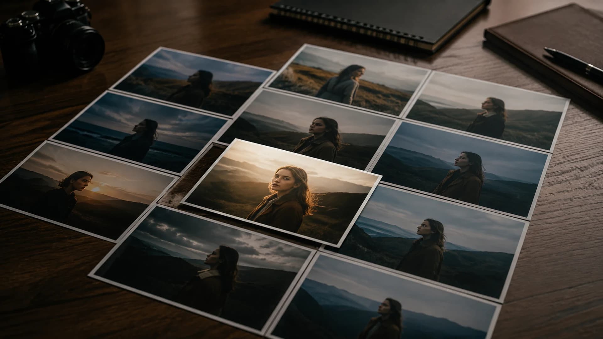
There is no universally correct Look. The useful choice is the one that supports a particular photograph and the way you want it to feel. A quiet portrait, a bright coastal travel frame, and a wet city street at night ask different questions. Instead of searching for the most dramatic effect, identify what the scene already contains and what should remain believable.
Read the image before browsing
Identify the subject, dominant light, contrast range, and important colors. Is the face the priority, or does the location carry the story? Is the light soft, hard, warm, cool, mixed, or low? Are there fragile highlights such as clouds, pale clothing, chrome, or neon? Does the image depend on natural greens, warm food tones, or blue-hour atmosphere? These observations become criteria for judging a Look.
- Name the subject and the detail that must remain easiest to read.
- Describe the light in plain language.
- Choose an intended feeling such as calm, energetic, intimate, tense, clean, or nostalgic.
- Decide which colors must stay credible and which may move creatively.
Match character to intent
A restrained Look can preserve a documentary or editorial feeling, while a denser, cooler option may support tension or night atmosphere. Warmer, open Looks often suit travel, food, or relaxed lifestyle work. These are tendencies, not rules. A sunset does not require more warmth, and a night photograph does not need crushed blacks. Sometimes resisting the expected treatment creates the more convincing result.
Use Look Browser categories to narrow the search, then compare a few candidates on the actual image. Names and descriptions suggest intent, but the canvas is the test. CineLook Neutral Cinema is a restrained CineLook product Look, not an official camera transform. Modern Drama offers a different controlled color and contrast direction. Neither is automatically better; each changes what the viewer notices.
Judge tone as well as color
Look at highlight behavior, shadow separation, midtone contrast, and saturation together. A palette may be attractive while its tonal structure hides a face or turns a textured jacket into a dark shape. Conversely, a technically open image may feel too neutral. Use Exposure, Contrast, Highlights, and Shadows after selection to learn whether a promising Look can be adapted without fighting its basic character.
Build a short decision loop
- Preview one restrained, one moderate, and one expressive candidate.
- Normalize obvious exposure differences before comparing character.
- Use Compare and inspect the same three areas for every candidate.
- Select the option that reaches your intent with the fewest extreme corrections.
- Repeat the approved direction across related images, reviewing each source independently.
AI Color Analysis can provide measured observations and recommendations, but it does not know the full purpose of your photograph. Use it to discover alternatives or confirm what you see. Your intent remains decisive. Over time, note which Looks tend to work for certain lighting patterns, then continue testing when a new scene differs. Experience should make your shortlist faster, not make your choices automatic.
When choosing for a series, test the candidate on more than the hero frame. Include the darkest image, the brightest one, and a frame with important skin or local color. A Look that survives those tests gives you a more stable foundation. You may still change exposure per frame, but the shared contrast and palette should continue to support the same visual idea.
Make the decision at the size and background in which the work will be viewed. Strong contrast may suit a small social image but feel heavy in a larger portfolio presentation. Delivery context is another part of creative intent.
The right Look is not the loudest one; it is the one that makes the image's intention easier to feel.Compare Looks in Studio