
Cinematic Color Beyond Faded Shadows
Cinematic color comes from intentional relationships between subject, palette, contrast, highlights, shadows, and sequence—not one faded formula.
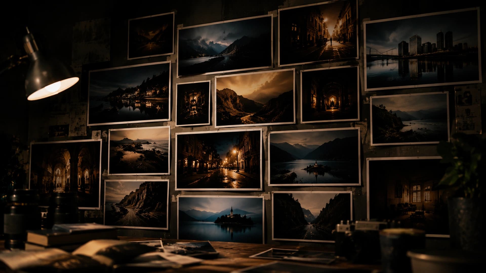
Faded shadows, teal highlights, orange skin, and reduced saturation have become shorthand for cinematic color. Any of these can be useful, and none defines cinematic color by itself. Applied without purpose, a recognizable treatment can flatten depth, weaken subject separation, and make unrelated photographs look like the same preset. Cinematic meaning comes from relationships: what is bright or dark, which colors support or oppose each other, and where the viewer's attention is guided.
1. Cinematic Color Is Not One Look
A clean commercial image, a dense night frame, and a soft travel portrait can all feel cinematic through different tonal structures. Teal and orange, faded blacks, desaturated palettes, heavy contrast, warm highlights, and cool shadows are vocabulary, not proof. The same treatment applied indiscriminately can weaken rather than improve an image.
2. Start With the Light
Color should respond to the photograph's existing light: daylight, artificial light, a warm interior, a cool exterior, dusk, overcast, mixed lighting, reflected light, or a dominant practical source. The edit should understand those relationships before reshaping them. That does not mean realism is mandatory; it means the direction should begin from what the light already offers.
3. Find the Important Color Relationship
Instead of evaluating every color independently, identify the relationship carrying the image: a warm subject against a cool environment, neutral architecture with one strong accent, a cool evening sky against warm windows, a muted environment around a saturated subject, or similar hues separated by luminance. Relationships matter more than individual RGB values, because they describe how the image works as a whole.
Naming the relationship also sets the stopping point. If the treatment strengthens that relationship, the edit is working. If it draws attention to a secondary color instead, the edit may be moving the wrong way.
4. Separate Subject From Background
Color can act as a hierarchy tool. Reducing competing background color, preserving stronger subject color, changing the warm-cool balance, or using tonal separation alongside color can keep multiple areas from competing equally for attention. CineLook does not automatically mask a subject or protect skin, so these decisions are made through the overall Look and adjustment controls, applied with the subject in mind.
5. Saturation Is Not the Same as Color
Increasing saturation rarely solves an unclear palette. Color decisions involve saturation, balance, temperature, tint, contrast, and luminance relationships together. Exposure, Contrast, Temperature, Tint, Saturation, and Vibrance are the controls used to test those relationships. A palette can feel rich because of clear separation, not because every value is more intense.
6. Warm and Cool Need a Reason
Warm-cool contrast is a relationship, not a formula. Warm practical lights within cool evening ambience, cool shadows retained under warm sunlight, or a neutral subject against warmer surroundings can all work when they follow the scene, subject, atmosphere, and intended emphasis. Without that reason, the relationship becomes decoration.
7. Protect Useful Neutrals
Not every part of an image needs strong color treatment. Useful neutral areas provide visual rest, make accent colors stronger, preserve believable materials, stabilize architecture, and keep skin or familiar objects recognizable. A controlled palette can be stronger than an image where every color has been pushed.
8. Use Looks to Explore Color Relationships
CineLook Looks are starting interpretations, useful for testing broad visual directions and seeing different color relationships quickly. The Looks library makes comparison easy, and a direction chosen on a public page can open in Studio and continue in the same session. A Look is not an automatic final grade or a guaranteed cinematic solution. It is a hypothesis for the photograph to test.
9. Refine the Direction in Studio
After choosing a promising direction, refinement is about making the relationship hold together on the actual image. Exposure, Contrast, Temperature, Tint, Saturation, and Vibrance are the adjustments used to do that. Small changes can significantly alter color relationships even when the Look itself remains the same, so refinement should be measured and reviewed.
10. Compare Before You Adapt
After viewing a strong grade for long enough, it can start to feel normal. Compare keeps Original and Graded available as a direct visual test. Use it to check whether saturation has become excessive, whether color casts are overpowering, whether the original light still makes sense, whether important neutral references disappeared, and whether the grade is helping the subject.
Compare is most useful early and often, before the graded image has had time to become the new normal in the viewer's memory.
11. Read the Scopes Without Letting Them Grade for You
RGB and Luma histograms can show channel distribution, clipping, tonal concentration, and major channel imbalance. They describe the image; they do not determine the creative answer. A histogram can confirm that a highlight is clipping, but only the user can decide whether that highlight matters.
12. AI Color Analysis Is Another Perspective
AI Color Analysis can help surface observations, identify color characteristics, and provide analytical guidance. It does not choose the correct grade, create the finished color automatically, or replace visual judgment. The user remains the creative authority.
13. Avoid the “Cinematic” Checklist
A mechanical checklist cannot fit every photograph. Crushing or fading blacks, making shadows teal, pushing highlights orange, lowering saturation, and adding contrast may produce a recognizable style, but the same sequence cannot serve daylight street photography, interiors, travel images, portraits, architecture, and night scenes equally. A coherent image matters more than recognizable grading tricks.
14. Know When Color Is Finished
Ask whether the subject reads clearly, important colors remain believable, one area is unnecessarily demanding attention, the warm-cool relationship supports the light, neutrals have not disappeared, saturation is not carrying the whole edit, the image still feels like the scene it came from, and the grade is supporting the photograph rather than advertising itself. Stronger processing is not automatically a stronger result. When the direction is clear and stable, the color is probably finished.
15. Final Principle
Cinematic color is not a recipe for making every image look alike. It is the practice of controlling color relationships so that light, subject, atmosphere, and attention work together. CineLook helps creators explore and refine those relationships; it does not decide them automatically.
Cinematic color is a system of attention, not a single shadow treatment.Explore color relationships in Studio