
Choosing a Visual Direction
How to choose a visual direction for a photograph before adjusting: read the image, decide what should stay and what can change, compare real alternatives, and refine with intent.
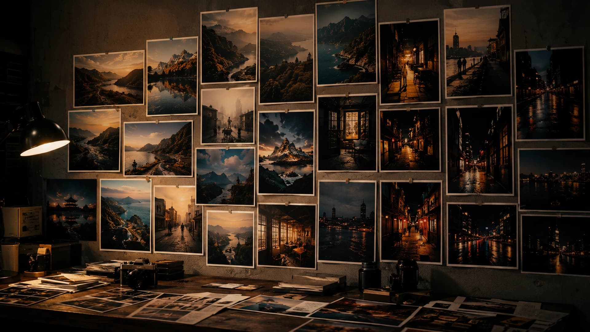
A visual direction is not a preset choice. It is a decision about what the image should emphasize, preserve, simplify, or change. Many weak edits begin in the wrong place: sliders move before the photograph has been asked what it needs. This article is about making that decision first, then letting CineLook help explore and refine it.
1. Direction Comes Before Adjustment
Before editing, ask a few questions that establish intent. They do not have to be polished; they only need to be specific enough to guide the next choices.
- What should the viewer notice first?
- Is the photograph driven by light, color, subject, atmosphere, or geometry?
- Should the edit preserve realism or deliberately stylize it?
- Which parts of the image should remain neutral?
- What should become quieter?
2. Read the Photograph First
Evaluate the original before applying a Look. Look for subject hierarchy, the dominant light source, highlight character, shadow detail, warm and cool relationships, color distractions, and how much contrast the scene already contains. Notice whether the image feels soft, graphic, quiet, bright, dense, or balanced. If the image is already graphic, an additional contrast push may fight it. If it is quiet, a saturated palette may change its character entirely. These observations are not rules. They are a map of what the photograph already offers.
A useful way to begin is to describe the photograph in one plain sentence. If the description mentions both the light and the subject, the edit can support both instead of favoring one at the expense of the other.
3. Identify What Should Stay
A visual direction is partly defined by what should not change. That might be a natural skin tone, recognizable evening light, a specific red sign, a cool ambient sky, useful shadow detail, neutral architecture, or restrained saturation. Naming these qualities prevents an edit from becoming generic. If a treatment erases what made the moment specific, it is not a direction; it is a replacement.
4. Decide What Can Change
Then identify what the grade may legitimately reshape: warmer highlights, cooler shadows, reduced distracting saturation, stronger tonal separation, softer contrast, deeper blacks, quieter background color, or clearer subject and background separation. Not every image needs all of these. The list simply marks the room the edit has to work within.
5. Use Looks as Directions, Not Answers
CineLook Looks are starting visual directions. The Looks library makes it easy to explore different interpretations quickly, and a direction chosen on a public page can open in Studio and continue in the same session. A Look can suggest tonal character, highlight behavior, and color separation, but it still needs judgment. It is a hypothesis to test against the photograph, not a label to obey.
The same Look can behave differently on different photographs, which is exactly why comparison and refinement remain part of the workflow. The direction is chosen because it helps this image, not because it carries an appealing name.
6. Compare More Than One Direction
Trying several meaningfully different directions is often more useful than making tiny variations of the first choice. Compare a cleaner, more neutral treatment with a warmer, nostalgic one; a cooler, restrained direction with a higher-contrast, graphic direction; or a softer, quieter treatment with a denser one. Purposeful comparison reveals what the image supports better than random preset browsing.
7. Evaluate the Image, Not the Look Name
Look names are references, not instructions. Judge the result on the photograph: does the subject read more clearly, does the light feel believable, are important colors still working, have highlights become harsh, have shadows collapsed, and does the image feel more coherent? There is no single objectively correct answer. The direction is working when it supports what the image already is.
If a treatment makes the photograph feel more like itself, it is probably moving in the right direction. If it makes every image feel like the same product, the direction has begun to dominate the work.
8. Use Compare to Reset Your Eyes
Repeatedly seeing a graded image can normalize an overly strong edit. Compare keeps Original and Graded available as a direct visual test, so the change can be judged while it is still easy to revise. Check whether the edit improved hierarchy, whether saturation or contrast became excessive, and whether important qualities of the original were lost. A comparison is most honest when it happens early.
9. Use Scopes as Support
RGB and Luma histograms describe the rendered values. They can show clipped highlights, channel imbalance, or how the tonal range is distributed. Scopes are supporting evidence, not creative authority. A histogram can confirm that highlights are close to clipping; it cannot tell the user whether the clipped area matters.
10. AI Color Analysis as Guidance
AI Color Analysis can add another analytical perspective and suggest Looks, but it does not choose the correct visual direction. It is guidance and support for observation. The creative authority stays with the user, because purpose and context live outside the pixels.
11. Refine Only After Choosing a Direction
Once the direction is clear, adjustments refine rather than discover the look. Exposure, Contrast, Temperature, Tint, Saturation, and Vibrance are the tools used to make the chosen direction hold together on this specific image. Refinement should be short and reviewable: change one relationship, compare, and decide.
The adjustment order matters less than the habit: evaluate, change, compare, and decide. A small number of deliberate changes is easier to understand than a long sequence of small corrections.
12. Know When the Direction Is Strong Enough
A successful direction often feels coherent before it feels dramatic. Ask whether the subject remains clear, the light is still convincing, the colors are working together, and nothing is pulling attention unintentionally. Does the edit support the photograph rather than advertise the grade? Strong editing can be restrained; the point is that every change has a reason the user can name.
When the answers to those questions are clear, additional processing usually adds noise rather than meaning. A direction strong enough to explain is usually strong enough to stop.
13. Final Principle
A strong edit begins with deciding what the photograph should become, and equally, what it should remain. CineLook exists to help explore and refine those decisions, not to replace them. The goal is a direction the user can explain, repeat, and trust across the images that matter.
Choose what the photograph should become, and equally, what it should remain.Explore visual directions in Studio