
A Complete Daylight Edit
Grade one daylight photograph from assessment through Look selection, tonal and color refinement, comparison, crop, and export.
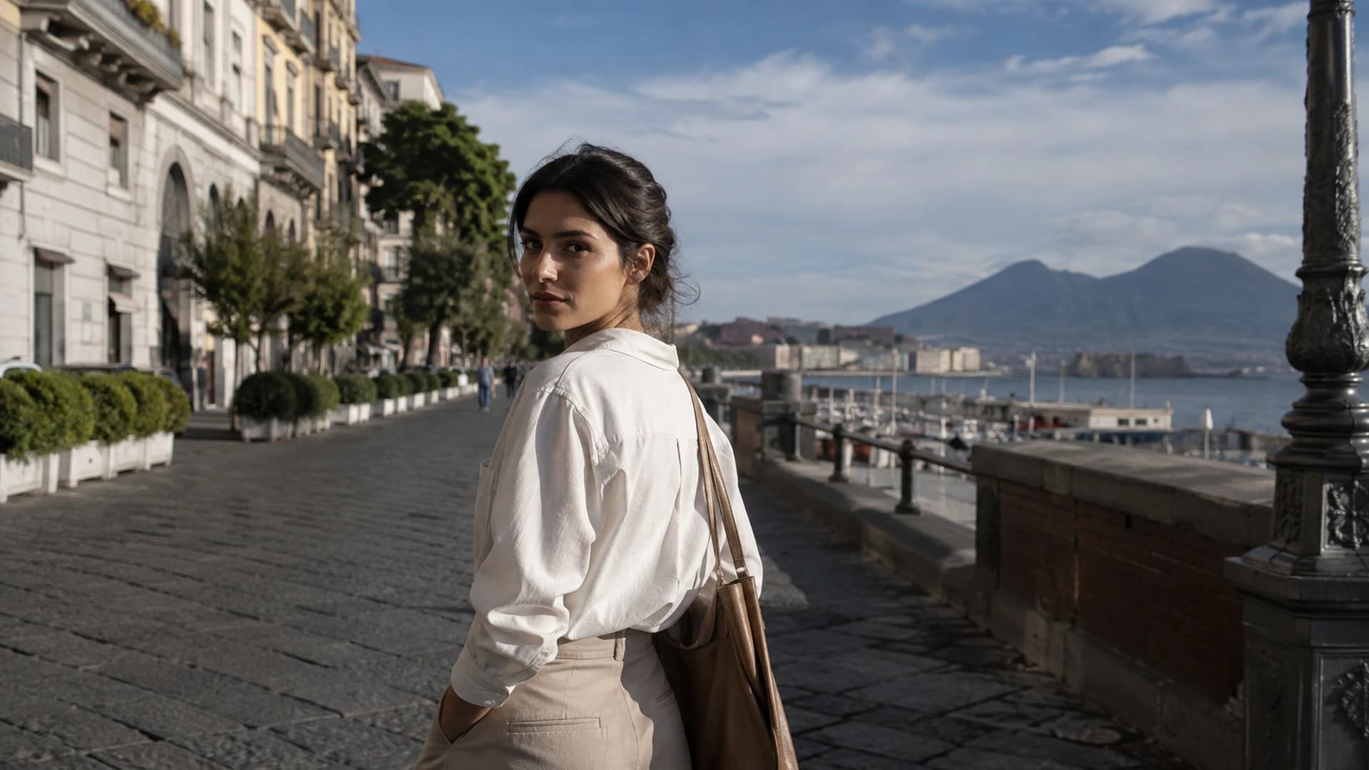
This lesson walks through one complete daylight edit. The steps are decision points, not fixed values, because every photograph asks slightly different questions. What matters is a repeatable sequence: assess the source, choose a direction, refine tone and color, compare, and deliver. This workflow should work whether you are editing a street portrait, a coastal scene, or a window-lit interior.
Start with the original image
Open the image in Studio and view it at a size where you can actually see the subject. Name the detail that must survive the grade: a face, a white shirt, green foliage, a skyline, or the texture in a wooden floor. Also note what you want the final image to feel like. A daylight edit can be clean and bright, warm and soft, or more film-like and restrained. The purpose gives every later decision a target.
Read the light before choosing a Look
Before choosing a Look, read the light. Is it direct and hard, or soft and overcast? Is the sun behind the subject, on the side, or overhead? Are shadows deep or open? Does the sky dominate the frame? These observations tell you what the image already contains and what a Look should preserve. AI Color Analysis can summarize measured color and tonal characteristics and suggest options, but it is guidance rather than creative authority. Histogram and Scopes provide evidence about the tonal range; they do not decide what the photograph should mean.
Choose a visual direction
Open the Look Browser and preview two or three candidates on the actual image. If the scene is bright and relaxed, a restrained Look may preserve daylight. If you want a more textured finish, a film-inspired direction may add character. Compare each candidate by looking at the same areas: skin, sky, shadows, and the brightest important highlight. Choose the direction that supports the scene with the fewest extreme corrections. Avoid judging from thumbnails alone.
Correct Exposure
Now decide whether the overall image needs to be brighter or darker. Look at the subject first. If the face or main object sits too low or too bright, use Exposure to place it where it reads naturally. Leave Exposure alone if the subject already sits correctly, even when the histogram looks unusual. A bright daylight scene can have most of its values in the upper range, and that can be correct. Use Highlights and Shadows only when specific regions need different treatment.
Refine Contrast
With the Look and Exposure in place, check how clearly the subject separates from its surroundings. Raise Contrast when the image feels flat and the important relationships need more separation. Reduce Contrast when hard light has already created strong separation and the skin or highlights are starting to look brittle. Watch the histogram as a guide, but judge the photograph. A sky can be bright without being blown, and a shadow can be deep without hiding detail.
Refine Color / Temperature where necessary
Daylight rarely needs dramatic color correction, but it may need a small balance check. Find a neutral reference in the frame: a white wall, a gray surface, paper, or a shirt that should be neutral. If that surface looks too warm, cool, green, or magenta, use Temperature and Tint to bring it back while keeping the scene's natural feeling. Do not neutralize every warm tone in a sunset or a golden-hour portrait. Some warmth is the light, not an error.
Compare Original and Graded
Use Compare to judge Original against Graded. Ask whether the subject reads more clearly, the highlights and shadows remain believable, and the color supports the intended mood. A more noticeable result is not automatically better. Look away briefly, then compare again. If the change feels like it is only adding drama, reconsider the direction before adding more adjustments.
Crop only when composition benefits
Crop only when it improves the composition. The purpose is to strengthen framing, remove an obvious distraction, or match a delivery format, not to fix a grade. A daylight image that needs constant cropping may simply need a different composition choice. Keep the crop simple and remember that export dimensions can also be set later. Layers and History are available if you want to test alternative compositions without losing the current grade, but they are not required for this workflow.
Review the final image
Before export, review the image the way a viewer will first encounter it. At normal size, does the subject hold attention? At a larger size, do the skin, sky, and textured shadows stay believable? Check the histogram one final time for accidental clipping, then ask whether the image still feels like daylight. The grade should make the light more readable, not replace it with a different scene.
Export
Choose the format, resolution, quality, and filename that fit the delivery. Export the file, then inspect the downloaded result rather than trusting the canvas preview. Confirm that the exported image matches the grade you approved. If the destination needs a different size or crop, return to the project rather than re-exporting blindly. The goal is one clean, reviewed file that can travel to the next stage.
A daylight edit is finished when the image still feels like daylight and the subject is easier to see.Work through a daylight edit in Studio