
What Makes a Film Look Feel Cinematic?
Learn the visual traits that make film-inspired grades feel cinematic, from tone and contrast to highlight behavior and restrained color.
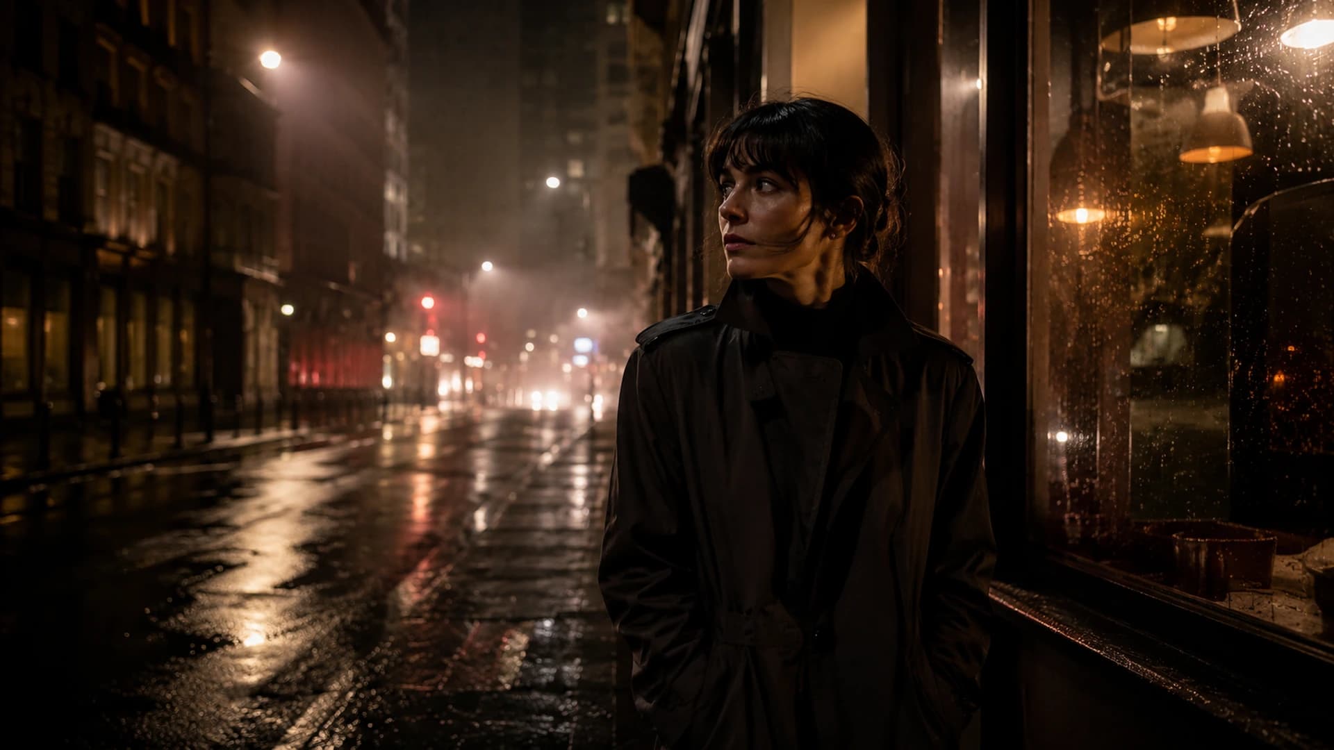
People often talk about cinematic color as if one formula exists. It does not. A quiet period portrait, a dense crime frame, and a soft travel image can all feel cinematic for different reasons. The word is useful when it describes intentional visual character: a controlled tonal structure, a believable color direction, and a consistent feeling across the image. CineLook offers film-inspired interpretations, not exact reproductions of any manufacturer's scientific process.
There is no single cinematic color
Different cinematic treatments can be clean, soft, dense, warm, cool, restrained, or stylized. The Look name and category describe intention, but the canvas is the test. What makes a result feel cinematic is usually coherence: the tones, contrast, and color appear to belong to one deliberate system rather than a collection of unrelated effects.
Tone comes before color
Before judging color, check the brightness structure. Where does the eye land first? Is there a clear hierarchy between subject, midtones, and background? A grade can have beautiful color and still feel weak when the tonal relationships are muddled. Establish the subject early, and every later color decision becomes easier to evaluate.
Contrast shapes the image
Film-inspired Looks often manage contrast through overall separation plus highlight and shadow behavior. A denser Look may close the blacks while protecting a gentle rolloff in the highlights. A softer Look may compress the range while keeping the shadows open. Neither is automatically more cinematic. The choice should match the scene and the intent.
Highlights and shadows create character
Highlight behavior changes how bright surfaces read. Some Looks soften or warm the brightest areas, while others keep them clear and neutral. Shadow behavior changes how much darkness and texture remain. Look for whether the treatment protects the details that matter: skin, sky, clothing, architectural edges. When an important surface clips or disappears, the character stops feeling like a choice.
Color separation matters more than saturation
Film-inspired color often relies on separation rather than high saturation. Warm highlights and cooler shadows can create depth, while skin and neutrals stay controlled. Two colors can feel rich because they are clearly different, even when each is restrained. Saturation alone is a poor measure of color quality. If the palette starts competing with the subject, reduce intensity before adding more.
Consistency makes a Look believable
Consistency is what separates a deliberate grade from a collection of effects. The relationship between highlights, shadows, skin, and neutrals should remain stable across the frame. The same applies across a series: the Look should feel like one visual world even when exposure or subject changes. Batch can apply a selected direction, but the decision to keep it consistent remains yours.
Choosing a film-inspired direction in CineLook
Start with concepts you already know. Camera Negative vs Print Film explains the difference between a flexible base and a finishing character. What LUTs Can and Cannot Do explains that a `.cube` export carries the color transform while spatial effects such as grain, bloom, and vignette are excluded. When previewing Looks, compare candidates on the actual image and decide which treatment supports the subject. The Look name is a starting point, not a guarantee.
Key takeaway
Cinematic is not a color preset. It is a coherent visual language that respects the subject, uses tone before color, treats highlights and shadows deliberately, and keeps saturation restrained enough to support the frame.
The most cinematic grade is often the one that makes the image feel inevitable.Compare film-inspired directions in Studio