Faded Release Print
Aged release-print character with raised blacks, softened contrast, uneven dye fading, and restrained warm contamination through the highlights.
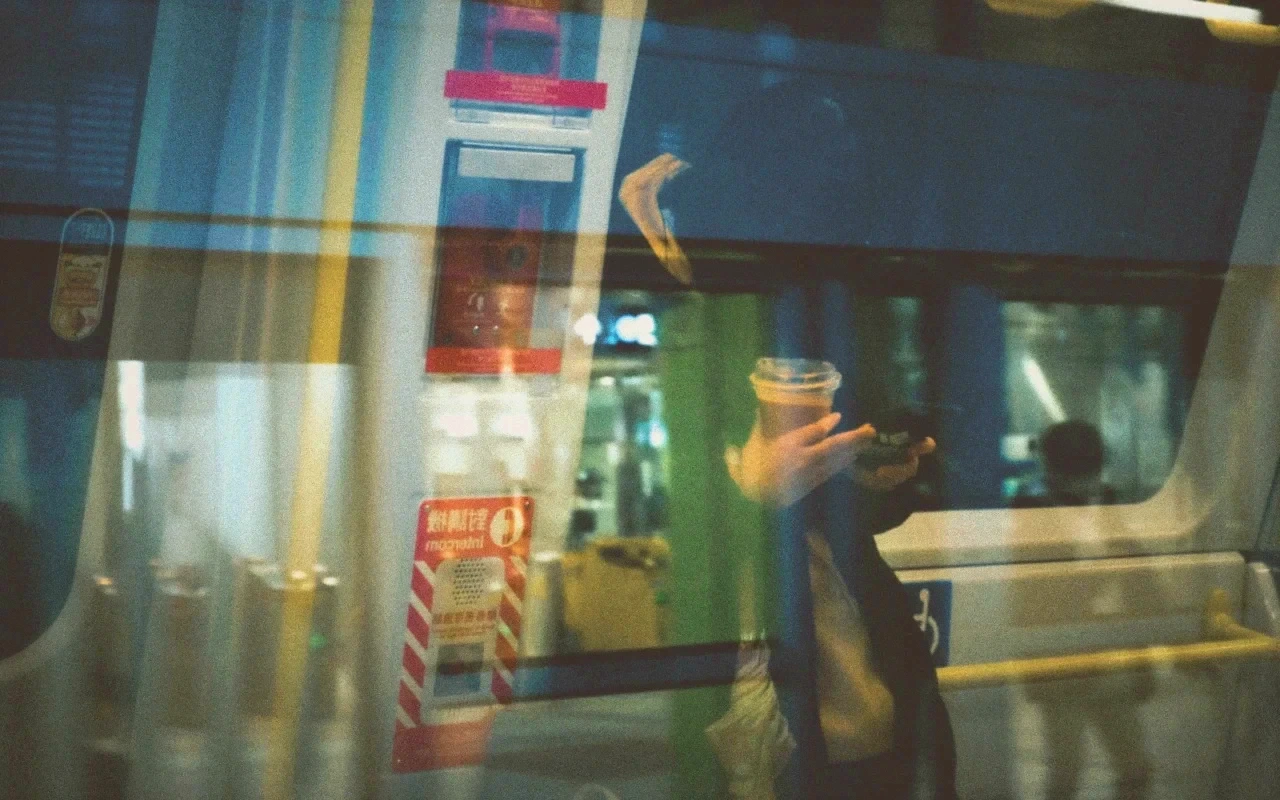
Visual character
Uneven dye fade with warm aged highlights
Best for
- Period finishing
- Archival release-print character
- Memory and flashback sequences
Lighting conditions
- Balanced cinema masters
- Warm daylight scenes
- Low-contrast archival styling
Color character
The CineLook Faded Release Print transform softens an image rather than rebuilding its color architecture. Its definition carries a tone curve and no channel matrix, so the change comes from tone and saturation rather than a cross-channel cast. That curve lifts the shadow end by 0.028, adds a modest 0.012 rise through the midtones and pulls the highlight end back by 0.016. With contrast reduced 17 points and shadows lifted 22, black sits visibly raised and the frame flattens. Highlights are held down 18 points and paired with a 38-point rolloff, so bright areas ease toward white instead of clipping. Saturation drops 28 points while vibrance moves only 4, leaving color muted and slightly uneven rather than uniformly gray. Temperature rises 9 and tint 3 for restrained warmth that gathers in the highlights. Exposure nudges up 0.08, grain sits at 14 for a medium texture, and bloom at 8 with vignette at 5 adds a faint haze and edge falloff.
When to choose it
The transform suits period finishing and any sequence that should read as an archival release print rather than a freshly graded master. Memory and flashback passages are its natural home: raised blacks and reduced saturation set a scene apart from its timeline without a heavy vignette or hard cast. Balanced cinema masters accept the change cleanly, because the curve moves each end of the scale by small amounts and leaves midtone separation intact. Warm daylight scenes gain from the restrained warm contamination, which reads as age, not a filter. Low-contrast archival styling is the other fit, since a flat, gently stained image is the intended destination. Material that carries strong contrast, saturated practicals or a modern palette will fight the desaturation; the look works when the source is well exposed and neutral enough to take a quieter rendering.
Working with it in Studio
In CineLook Studio the transform arrives as a starting grade, and much of the work is deciding how much fade to allow. Contrast and Shadows are the pair to adjust: lowering Contrast pushes the image toward washed archival flatness, while trimming the 22-point shadow lift restores black density where the frame needs one. Highlights and Highlight Rolloff control how fast the bright end gives way; the 38-point rolloff is generous, and reducing it keeps separation in windows and skies. Temperature and Tint refine the warm contamination, Saturation sets the amount of dye loss, and Vibrance stays close to neutral. Film Grain, Bloom and Vignette remain inside the app, so a .cube LUT export carries Exposure, Contrast, Highlights, Shadows, Temperature, Tint, Saturation, Vibrance and Highlight Rolloff, but not the grain, glow or edge darkening.
How it compares
The comparison turns on contrast direction. Bleach Bypass Print raises contrast 27 points and pulls shadows down 22, for dense blacks and a hard image; Faded Release Print moves the other way at minus 17 contrast and plus 22 shadows. Bleach Bypass Print also desaturates harder at minus 42 and adds a 13-point vignette; Faded Release Print stops at minus 28 and a 5-point vignette. Cross Process runs hotter: contrast plus 21, saturation plus 16, vibrance plus 18 and tint at 6 for a split, chemically shifted palette. Choose Bleach Bypass Print for silver-toned drama, Cross Process for aggressive saturated color, Faded Release Print for gentler archival fade.
Where it fits in a grade
Faded Release Print is a finishing print, so it belongs at the end of a chain rather than at its start. It carries no native balance or nominal speed, meaning it does not stand in for the camera image; it lands on a base negative or an image already corrected. That order matters. Because contrast is low and shadows are lifted, it should follow exposure and black-level decisions, where the fade can be judged against a dense image, rather than precede them and leave the base hard to read. Its soft highlight response and medium grain sit over a corrected frame without a second contrast push. Pair it with a neutral base and let it close the grade.
Transform parameters
Against a neutral starting point the CineLook Faded Release Print transform moves exposure +0.08, contrast -17, highlights -18, shadows +22, temperature +9, tint +3, saturation -28, vibrance -4, film grain +14, bloom +8, vignette +5 and highlight rolloff +38. Its channel matrix keeps the 1.018 / 0.992 / 0.970 diagonal and mixes at most 0.024 of one channel into another, so hues stay close to their source while crosstalk stays controlled. The luma curve sits 0.016 below the linear ramp at three-quarter tone, which is where the shoulder starts to bend.